‘r’ is a parameter used in the CORRELATION ANALYSIS. It is also called the correlation coefficient. It is a measure of the strength of the linear relationship between TWO variables. Value of ‘r’ ranges from -1.00 to +1.00; a perfect correlation is indicated by a value of 1.00, positive or negative. A value of 0 indicates that there is no correlation between these two variables.
R-squared is a parameter used in the REGRESSION ANALYSIS. It is also called the coefficient of determination. Just like the ‘r’, R-squared is also an indicator of the strength of the relationship between variables. However, here the relationship could involve MULTIPLE variables. The regression analysis is used to determine the impact of one or more x-variables on the y-variable. R-squared is an indicator on how well the x-variables can be used to predict the value of the y-variable. In other words, R-square indicates the strength of the regression equation which is used to predict the value of the y-variable. Value of R-squared ranges from 0 (poor predictor) to 1 (excellent predictor).
Since the regression analysis is nothing but a correlation analysis involving multiple variables, the R-squared is also known as the multiple correlation coefficient.
So, in simple terms, ‘r’ is an indicator of the strength of the relationship between two variables where R-squared is an indicator of the strength (goodness of fit) of the linear equation that predicts the value of one variable as a function of one or more variables.

Regression Analysis
Regression analysis is a method to define the mathematical relationship between an output variable (y) and one or more input variable (x1, x2,….etc.) This mathematical relationship or equation is called the regression model.
Basically, the regression model is an equation that can be used to predict the value of ‘y’ using the input variables i.e. ‘y’ expressed as a function of x1, x2…etc.
In order to understand a regression model, we start with a simple linear regression model. Here we find the relationship between the output variable and a single input variable.
Linear Regression Model
The regression model is y = b0 + b1x + S, where
Basically, the regression model is an equation that can be used to predict the value of ‘y’ using the input variables i.e. ‘y’ expressed as a function of x1, x2…etc.
In order to understand a regression model, we start with a simple linear regression model. Here we find the relationship between the output variable and a single input variable.
Linear Regression Model
The regression model is y = b0 + b1x + S, where
- y = output variable, also known as dependent variable
- b0 = constant or coefficient of constant. Graphically, this is the y-intercept or the value of y when x = 0
- b1 = coefficient of x i.e. the slope or rate of change of y for a unit change of x
- x = input variable. X, along with the constant is also known as predictor since they are used to predict the value of y. It is also called the independent variable.
- S = error or residual value. I.e. it is the difference between the actual value of y and the value of y predicted by the regression model.
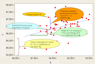
FIGURE 1: Regression Chart
Understanding the Regression Model
The regression model is better defined and understood using the regression model parameters. Let’s take the result of a regression analysis in Minitab.
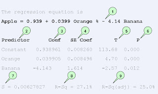
FIGURE 2: Regression Equation
- The first line is the regression equation where y is predicted as a function of x
- Predictor – x and the constant are the predictors used to predict the value of y
- Coefficient – the value of b0 and b1, i.e. the coefficients of constant and x. The size of the coefficient is a measure of the magnitude of the influence of that predictor on y and the sign (+ve or –ve) of the coefficient shows the direction of the influence.
- SE Coefficient – It is the Standard Error of the coefficient and is an estimate of the standard deviation of the coefficient. This is the precision with which the coefficients are calculated. The SE coefficient by itself doesn’t shed much light into the strength of the model. This is used in the t-test of the regression model to check the strength of the model. We check the strength of the model using the results of the t-test.
- T-value – T-value if coefficient divided by the SE coefficient. Just like the SE coefficient, the T-value by itself does not tell us much about the strength of the model. The T-value is compared with values in the Student’s T Distribution to determine the P-value of the model. The Student’s T Distribution describes how the mean of a sample with n observations is expected to behave. The P-value is a measure of the strength of the model.
- P-value – If 95% if the Students t distribution is closer to the mean than the T-value, of the coefficient, then the P-value of the coefficient is 5%. The P-value is the probability of seeing a similar result as ours in a random sample of the same size where the predictor has no influence on y. In simple terms, the P-value is the probability that the effect of the predictor on y occurred by a random chance i.e. the probability that the predictor has no real influence on y. It is generally accepted that if the P-value if 5% or less, we can reject this notion and conclude that the predictor has influence on y. A P-value of 5% (0.05) or less means that there is only a 5% chance that the results we are seeing is due to a random chance, i.e. there is a 95% chance that the predictor has influence on y. It is important to note that the P-value only shown the presence of a relationship and is not a measure of the magnitude of the relationship.
- S – S is the residual or error of the regression equation. This is the difference between the predicted and the actual value of y i.e. an estimate of the standard deviation of the regression equation. Graphically, it is the variation of points around the regression line. S is also known as the sum of squares. The lower the value of S, the better the regression equation.
- R-Sq measures the goodness of fit of the regression equation. This measures how well the predictors are able to predict the value of y. R-Sq ranges from zero (poor predictor) to one (perfect predictor). Basically the R-Sq value is the fraction of variation in y that can be predicted by the predictors. It is also known as the coefficient of determination. R-Sq of 1 does not occur in real life situations. The accepted value for R-Sq varies by situation, but 0.4 is generally considered an acceptable level.
- Adjusted R-Sq. Adjusted R-Sq is similar to R-Sq, but it standardizes the value of R-Sq by taking into account the number of predictors involved in the equation. Generally, the larger the number of predictors, the stronger the regression model and R-Sq increases. Adjusted R-Sq modifies the R-Sq and makes it independent of the number of predictors involved. This makes it easier to compare one regression model to another.
Checking if the regression model is good enough
The two key parameters on checking the goodness of the Regression model are P-value of each predictor and R-Sq (or adjusted R-Sq) of the equation.
P-value shows the statistical significance of each predictor. If the P-value is greater than 0.05 for any predictor, it means that the variable has no significance on y. The insignificant variables should be removed from the regression model and the regression should be redone.
R-Sq shows how well the regression equation can predict the value of y.
Correlation Analysis
Correlation analysis is a method to measure the strength of the linear relationship between 2 or more variables.
This is used to identify the key input variables of a process i.e. the input variables that have the highest impact on the process output.
The correlation analysis can be done using two methods 1) using a scatter plot or 2) using a correlation matrix.
Scatter Plot
Scatter plots show the correlation between the two variables graphically. However, this is a subjective analysis and cannot give the magnitude of the strength of the relationship. But the scatter plots can reveal any non-linear relationship that might exist between the 2 variables. The correlation matrix cannot reveal any non-linear relationship. So it is recommended that both methods be used when assessing the correlation between 2 variables.

Correlation Matrix
Correlation matrix is a quantitative measure of the strength of the linear relationship between 2 variables. This is done by using the ‘correlation coefficient’ or ‘Pearson coefficient’, ‘r’.
Value of ‘r’ ranges from -1 to +1. A value of 1 (positive or negative) indicates perfect correlation while 0 indicates no correlation between the variables.
Pearson Correlation (r-value)
P-value
While doing the correlation analysis, we also need to know the significance of the correlation. This is done by using the p-value.
Null Hypothesis: There is no correlation between the variables
Alternate Hypothesis: There is correlation
Lets say the confidence interval (CI) is set at 95% i.e. 0.95
If p-value is < 0.05 (1 - CI) = Reject the null hypothesis. i.e. there is correlation between the two variables.
The low p-value indicates that the correlation between the two variables is significant and did not happen by accident.
Correlation Analysis in Minitab
Minitab>> Stat >> Basic Statistics >> Correlation
Choose the columns containing the variables you need to correlate. Minitab calculates the correlation for every possible pairs in the list of columns selected.
By default, Minitab also displays the p-value for each correlation.
This is used to identify the key input variables of a process i.e. the input variables that have the highest impact on the process output.
The correlation analysis can be done using two methods 1) using a scatter plot or 2) using a correlation matrix.
Scatter Plot
Scatter plots show the correlation between the two variables graphically. However, this is a subjective analysis and cannot give the magnitude of the strength of the relationship. But the scatter plots can reveal any non-linear relationship that might exist between the 2 variables. The correlation matrix cannot reveal any non-linear relationship. So it is recommended that both methods be used when assessing the correlation between 2 variables.

Figure 1: Scatter Plot
Correlation Matrix
Correlation matrix is a quantitative measure of the strength of the linear relationship between 2 variables. This is done by using the ‘correlation coefficient’ or ‘Pearson coefficient’, ‘r’.
Value of ‘r’ ranges from -1 to +1. A value of 1 (positive or negative) indicates perfect correlation while 0 indicates no correlation between the variables.
Pearson Correlation (r-value)
- 0 then no relationship
- +1 or -1 perfect relationship
- between 0 and 0.3 little relationship
- between 0.3 and 0.5 low relationship
- between 0.5 and 0.7 moderate relationship
- between 0.7 and 0.9 strong relationship
- between 0.9 and 1.0 very strong relationship
P-value
While doing the correlation analysis, we also need to know the significance of the correlation. This is done by using the p-value.
Null Hypothesis: There is no correlation between the variables
Alternate Hypothesis: There is correlation
Lets say the confidence interval (CI) is set at 95% i.e. 0.95
If p-value is < 0.05 (1 - CI) = Reject the null hypothesis. i.e. there is correlation between the two variables.
The low p-value indicates that the correlation between the two variables is significant and did not happen by accident.
Correlation Analysis in Minitab
Minitab>> Stat >> Basic Statistics >> Correlation
Choose the columns containing the variables you need to correlate. Minitab calculates the correlation for every possible pairs in the list of columns selected.
By default, Minitab also displays the p-value for each correlation.
Mean and Standard Deviation
Anytime a process is mentioned, there are two separate attributes that needs to be understood. Process ‘population’ and process ‘sample’. Population of a process includes all individual units of that process while sample of a process means a random sample of individual units of the process.
In most cases, the process is measured based on a sample since it is practically impossible, time consuming and unnecessary to measure ALL individual units of a process. So the process attribute is determined based on the measurement of a sample set of units taken from the population.
It is assumed that the sample of the population reflects the characteristics of the population. Sample selection should be done carefully in order to meet this assumption.
Mean
Mean of a process is nothing but the average value of individual units. Mean of the population is called the population mean (μ) and mean of the sample is called the sample mean (Xbar)
Standard Deviation
Standard deviation is the spread of the individual values about the mean. It can also be stated as the average difference of individual values from the mean. A low standard deviation indicates that the individual data points lie close to the mean while a high standard deviation indicates that the data points are spread out further from the mean.
The symbol ‘σ’ is used to denote the standard deviation for the population while the symbol ‘s’ is used to denote the standard deviation of the sample.
See attached figure for the mathematical calculation of σ and s.
 Figure1: Calculation of σ and s
There is a slight difference in the mathematical formula use to calculate σ and s.
If the population size is N, N is used in the denominator to calculate the σ. But for a sample size of n, n-1 is used in the denominator to calculate s.
Explanation for this is here. Consider a population. The spread of the population is normal. Now consider a sample. Due to the normal property of the population, the probability of the samples to be closer to the mean is high. The samples have a tendency to lie closer to the centre.
Therefore, the variation of the sample is less than the variation of the population and is therefore considered ‘biased’. Therefore we use the denominator n-1 to compensate for this and make the variation bigger (and closer to that of the population) and hence remove this bias. This is statistically proven.
As the sample size increases, the sample variance will get closer to the population and n vs. n-1 will become less significant.
Variance
Variance is the measure of the amount of variation for a set of values. Variance is the square of std. deviation. We use standard deviation instead of variance due to the addictive power of the standard deviation. Variance is squared (a higher degree than the unit level) and is not in the same unit level as the individual units.
In most cases, the process is measured based on a sample since it is practically impossible, time consuming and unnecessary to measure ALL individual units of a process. So the process attribute is determined based on the measurement of a sample set of units taken from the population.
It is assumed that the sample of the population reflects the characteristics of the population. Sample selection should be done carefully in order to meet this assumption.
Mean
Mean of a process is nothing but the average value of individual units. Mean of the population is called the population mean (μ) and mean of the sample is called the sample mean (Xbar)
Standard Deviation
Standard deviation is the spread of the individual values about the mean. It can also be stated as the average difference of individual values from the mean. A low standard deviation indicates that the individual data points lie close to the mean while a high standard deviation indicates that the data points are spread out further from the mean.
The symbol ‘σ’ is used to denote the standard deviation for the population while the symbol ‘s’ is used to denote the standard deviation of the sample.
See attached figure for the mathematical calculation of σ and s.
 Figure1: Calculation of σ and s
There is a slight difference in the mathematical formula use to calculate σ and s.
If the population size is N, N is used in the denominator to calculate the σ. But for a sample size of n, n-1 is used in the denominator to calculate s.
Explanation for this is here. Consider a population. The spread of the population is normal. Now consider a sample. Due to the normal property of the population, the probability of the samples to be closer to the mean is high. The samples have a tendency to lie closer to the centre.
Therefore, the variation of the sample is less than the variation of the population and is therefore considered ‘biased’. Therefore we use the denominator n-1 to compensate for this and make the variation bigger (and closer to that of the population) and hence remove this bias. This is statistically proven.
As the sample size increases, the sample variance will get closer to the population and n vs. n-1 will become less significant.
Variance
Variance is the measure of the amount of variation for a set of values. Variance is the square of std. deviation. We use standard deviation instead of variance due to the addictive power of the standard deviation. Variance is squared (a higher degree than the unit level) and is not in the same unit level as the individual units.
I-MR Chart
I-MR chart is a good graphical method of displaying the process performance.
I-MR chart consists of 2 charts; Individuals (I) chart and Moving Range (MR) chart. The I chart allows you to track the process level and the MR chart allows you to track process variation.
I chart displays individual values of each measurement of the process and the mean of these values. The MR chart displays the variation for each measurement from the previous measurement (i.e. the variation of the process)
Uses of the I-MR chart
I-MR chart is mostly used for 2 purposes.
LCL and UCL
The LCL and UCL (control limits) for the I-MR charts could be misleading. The LCL and UCL are set automatically so that only 1 in 1000 points will fall outside this range. i.e. 99.9% values fall in this range. This is done to remove any outliers and give a better VISUAL DISPLAY of the values.
The purpose of the chart is to give a visual indicator of the process and the LCL and UCL does not serve any statistical purposes.
Please note that the control limits is not the same as the specification limits set by the customer. Control limits are not used to assess if the process falls within the customer specifications. It is used primarily to investigate the value and variation of the process and see if the process is in control or not.
For the I chart, the UCL and LCL are calculated based on
X Bar (Mean) +or- 3 R bar (Range) / d2
where d2 = 1.128
For the MR chart, the UCL is calculated based on
D4 * R bar (Range)
where D4 = 3.267
and LCL = 0.
The d2 and D4 are selected so that 99.9% of the data points fall within the range. This will give a good visual indication of the data points without the outliers masking the chart attributes.
Creating the I-MR Chart
Arrange the data in a column. If trying to compare multiple sets of data, create another column indicating the set in which the data belongs. The data needs to be sorted by set.
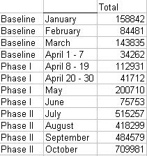
Open Minitab
Go to STAT>>CONTROL CHARTS>>VARIABLES CHARTS FOR INDIVIDUALS>>I-MR
Select the column of the data (here, column 3) in ‘Variables’
If you are comparing multiple sets of data, go to ‘I-MR Options’ button, go to ‘Stages’ tab and select the column of the stages (here, column 1) in ‘Define Stages’
Hit ‘OK’ and the I-MR chart is ready.
Using the I-MR chart to see if the process is in control or not

Look at the MR chart first as the control limits for the I-chart is derived from the Range. So, if the MR chart is out of control, then the process is out of control. However, it has also been pointed out that for a normally distributed process any out of control situation would be visible on both I chart and MR chart simultaneously. So either chart can be used to check if the process is in control or not.
If there are any points outside the control limits, then the process is not under statistical control.
However, even if all points are within the control limits, the process could still be out of control. These are the indicators for the process NOT being in control even if all points lie within the control limits.
Using the I-MR chart to compare multiple stages of the process or compare multiple processes

Here again, the processes should be checked for being in control. The chart gives you the mean and variation of the process at multiple stages (or that of multiple processes) and can be used to compare the performance.
I-MR chart consists of 2 charts; Individuals (I) chart and Moving Range (MR) chart. The I chart allows you to track the process level and the MR chart allows you to track process variation.
I chart displays individual values of each measurement of the process and the mean of these values. The MR chart displays the variation for each measurement from the previous measurement (i.e. the variation of the process)
Uses of the I-MR chart
I-MR chart is mostly used for 2 purposes.
- to see if the process is in control and to detect signs of special causes that might take the process out of control
- to compare the performance of the process at various stages. E.g. before and after implementing a change
LCL and UCL
The LCL and UCL (control limits) for the I-MR charts could be misleading. The LCL and UCL are set automatically so that only 1 in 1000 points will fall outside this range. i.e. 99.9% values fall in this range. This is done to remove any outliers and give a better VISUAL DISPLAY of the values.
The purpose of the chart is to give a visual indicator of the process and the LCL and UCL does not serve any statistical purposes.
Please note that the control limits is not the same as the specification limits set by the customer. Control limits are not used to assess if the process falls within the customer specifications. It is used primarily to investigate the value and variation of the process and see if the process is in control or not.
For the I chart, the UCL and LCL are calculated based on
X Bar (Mean) +or- 3 R bar (Range) / d2
where d2 = 1.128
For the MR chart, the UCL is calculated based on
D4 * R bar (Range)
where D4 = 3.267
and LCL = 0.
The d2 and D4 are selected so that 99.9% of the data points fall within the range. This will give a good visual indication of the data points without the outliers masking the chart attributes.
Creating the I-MR Chart
Arrange the data in a column. If trying to compare multiple sets of data, create another column indicating the set in which the data belongs. The data needs to be sorted by set.

Open Minitab
Go to STAT>>CONTROL CHARTS>>VARIABLES CHARTS FOR INDIVIDUALS>>I-MR
Select the column of the data (here, column 3) in ‘Variables’
If you are comparing multiple sets of data, go to ‘I-MR Options’ button, go to ‘Stages’ tab and select the column of the stages (here, column 1) in ‘Define Stages’
Hit ‘OK’ and the I-MR chart is ready.
Using the I-MR chart to see if the process is in control or not

If there are any points outside the control limits, then the process is not under statistical control.
However, even if all points are within the control limits, the process could still be out of control. These are the indicators for the process NOT being in control even if all points lie within the control limits.
- 9 consecutive observations on the same side of center line
- 6 consecutive observations, all decreasing or increasing
- 14 consecutive observations alternating up and down
- 2 out of 3 consecutive observations, more than 2 sigma on the same side of central line
- 4 our of 5 consecutive observations more than 1 sigma from the center line, on the same side
- 15 consecutive observations within 1 sigma from center line, no matter which side
- 8 consecutive observations more than 1 sigma from the center line, mo matter which side
Using the I-MR chart to compare multiple stages of the process or compare multiple processes

1.5 σ Shift in the Six Sigma Process
The Sigma (σ) of a process is calculated based on the ability of the process to stay within the specification limits.
Assuming that the mean of the process is in the centre of the Upper Specification Limit (USL) and Lower Specification Limit (LSL), the process has the same probability of staying inside the limit on EITHER side.
 Now in most cases, the process mean doesn’t stay exactly in the centre of the specification limit. The actual location of the mean is closer to one side than the other. This is called the Shift of the Mean.
 This means that the distance between the mean and specification limit is not the same on both sides. I.e. the process has more leeway on one side than the other and the probability of the process to stray outside the specification limit is higher on one side than the other.
 Since the performance of the process is measured based on its capability to stay inside the specification limit on EITHER side, the σ value is calculated by looking at the SHORTER distance between the mean and the specification limits.
I.e. Sigma level = Lower of [(USL – Mean) OR (Mean – LSL)] / σ
The SHORTER gap divided by σ will give the sigma level of the process.
E.g. let’s consider a 6 σ process. Here 6 σ is the theoretical σ level of the process, i.e. the distance from mean to LSL and USL to mean is the same and is 6 σ. The mean is assumed to be in the centre of the specification limits.
Let’s say that the actual mean of the process, when measured, appears to have shifted 1.5 σ to one side.
Now, the new Sigma level of the process is,
Theoretical Sigma Level – Shift of the Mean
i.e. 6 σ – 1.5 σ = 4.5 σ
So the process is now a 4.5 σ process instead of a 6 σ process and the defect level is 3.4 ppm.
 6 σ and 3.4 ppm
There is a notion that the 6 σ process yields a defect rate of 3.4 ppm. This is not entirely true as a real 6 σ process yields a defect rate of 0.002 ppm.
The 3.4 ppm concept came from a Motorola process where it was decided that a process will be called “6 σ Process” if
Assuming that the mean of the process is in the centre of the Upper Specification Limit (USL) and Lower Specification Limit (LSL), the process has the same probability of staying inside the limit on EITHER side.
 Now in most cases, the process mean doesn’t stay exactly in the centre of the specification limit. The actual location of the mean is closer to one side than the other. This is called the Shift of the Mean.
 This means that the distance between the mean and specification limit is not the same on both sides. I.e. the process has more leeway on one side than the other and the probability of the process to stray outside the specification limit is higher on one side than the other.
 Since the performance of the process is measured based on its capability to stay inside the specification limit on EITHER side, the σ value is calculated by looking at the SHORTER distance between the mean and the specification limits.
I.e. Sigma level = Lower of [(USL – Mean) OR (Mean – LSL)] / σ
The SHORTER gap divided by σ will give the sigma level of the process.
E.g. let’s consider a 6 σ process. Here 6 σ is the theoretical σ level of the process, i.e. the distance from mean to LSL and USL to mean is the same and is 6 σ. The mean is assumed to be in the centre of the specification limits.
Let’s say that the actual mean of the process, when measured, appears to have shifted 1.5 σ to one side.
Now, the new Sigma level of the process is,
Theoretical Sigma Level – Shift of the Mean
i.e. 6 σ – 1.5 σ = 4.5 σ
So the process is now a 4.5 σ process instead of a 6 σ process and the defect level is 3.4 ppm.
 6 σ and 3.4 ppm
There is a notion that the 6 σ process yields a defect rate of 3.4 ppm. This is not entirely true as a real 6 σ process yields a defect rate of 0.002 ppm.
The 3.4 ppm concept came from a Motorola process where it was decided that a process will be called “6 σ Process” if
- The (USL – LSL) / 2 σ = 6 i.e. Theoretical sigma level = 6, and
- The Mean has shifted by 1.5 σ, yielding an actual sigma value of 4.5 and corresponding defect rate of 3.4 ppm.
Excel Formula to Find Probability of Sigma Levels
Use the formula =(1-NORMDIST(Sigma Level,0,1,1))*1000000
Probability and PPM for Sigma Levels
Here is a chart depicting the probability, % defects and defects per million associated with each sigma level.


Understanding the Basic Six Sigma Concept
Six-Sigma is a fairly simple concept, but has been made complicated by over use of statistics. Here is a simple step by step explanation of the six-sigma process that is easy for a non-technical person to follow.
Once you gain a good understanding of the concept, you can start learning some of the six sigma tools that can be used to implement the methodology in practical projects.
Let consider a process. Every process has some sort of a performance target.
E.g.:
It is rare that the process meet this target 100% of the time. There is always some variation associated with the process. This variation will cause the process to be off the target a little bit. This is perfectly normal and every process is permitted a certain amount of variation from the target. As long as the process performance stays within this permitted variation, the process is considered good.
E.g. Time to make a pie is supposed to be 7 minutes, but is allowed a variation of plus or minus 1 minute. This means that the time to make the pie could be anywhere between 6 – 8 minutes, even though the expected time is 7 minutes.
Sigma value is a standardized way of stating how often your process performance will lie within that permitted variation. The higher the sigma value is, the better the process.
E.g. A 6-sigma process has a 99.99966% chance of staying within the permitted variation limits.
Statistics
Now, let’s get to the statistical part of the process. Lets get to know the important terms first
 Now we take a look at the process and collect some data on how the process is performing. E.g. measure the diameter of a number of holes mentioned in the previous example.
The sigma (σ) of the process is calculated based on these measurements. σ is nothing but the standard deviation of the process, which, in simple terms, is the variation that we expect to see in the actual process.
 Here, x would be the diameter of each hole, X is the average of all diameters measured and n is the number of holes measured.
The goodness of your process is determined by comparing the variation of your process with the permitted variation. If you have a low value for your σ in comparison to the permitted variation, it is highly unlikely that your process would go beyond the permitted variation.
The σ level for your process is nothing but the ratio of permitted variation to the process variation and indicates the capacity of your process to not stray outside the control limits on either side.
i.e. σ Level = (UCL – LCL) / 2 σ
Now, you have noticed that the control limit has been divided by 2 σ to calculate the sigma level. This is because we assume that the process mean is in the centre of the control limit and your sigma level is the capacity of your process to stay in limit to either side of the mean. Based on this assumption, the sigma level cal also be calculated as,
σ level = (Mean – LCL) / σ OR (UCL – Mean) / σ
Where (Mean – LCL) and (UCL – Mean) gives you the same amount of permitted variation (equal distance to both sides of the mean)
Now, if your process has only 1 control limit (E.g. a process with an expected success rate of 100% and a tolerance of 10%; no UCL, Mean = 100% and LCL = 90%), the same formula can be used to calculate the sigma level.
Sigma level tells you the probability of our process staying in the permitted variation. E.g. a sigma level of 3 means that 93.31% of the time, your process would stay in the permitted range. i.e. if you make 1 million pieces, 66,800 pieces will be defects (outside the permitted variation)
Here is a table with the probability associated with each sigma level. These values have been calculated using probability functions.

Now you must have noticed the bell shaped charts that represent the processes. Here is the reason.
If you plot all the measurements for the process, there is a good chance that most of the measurements lie close to the mean.
 The bell shaped curve is nothing but the probability of occurrence for each measurement. So there is a high probability for a measurement to lie close to the mean and as we move sideways from the mean (closer to the control limit), there is a lower probability of measurements. The area outside the control limits represent the probability of measurements falling outside the control limits.
 The shift of the mean
Now, it is not necessary for the process mean to be right in the centre of the control limit. This is called the shift of the mean.
What this means is that the distance between the control limit and the mean is not even on both sides. So to be on the safe side, the sigma level is calculated based on the shorter side.
I.e. Sigma level = Lower of (UCL – Mean OR Mean – LCL] / σ
This gap divided by the sigma will give the sigma level of the process. Say for the above 6 sigma process, the mean has shifted by 1.5 σ, now the shorter gap is 4.5 sigma and the process now becomes a 4.5 sigma process instead of a 6 sigma and the defects is now 3.4 ppm.
There is a notion that the six sigma process means 3.4 ppm. This is not true, the 6 σ process yields 0.002 ppm. The 3.4 ppm concept came from a Motorola process where they decided a process will be called six sigma if the USL – LSL / 2 σ = 6 and the Mean has shifted by 1.5, yielding an actual sigma value of 4.5 and corresponding 3.4 ppm.
Six sigma is a statistical term indicating how much you have deviated from your target. The notion behind the idea is that if you can measure your defects, you can systematically identify the causes for the defect and eliminate them.
Once you gain a good understanding of the concept, you can start learning some of the six sigma tools that can be used to implement the methodology in practical projects.
Let consider a process. Every process has some sort of a performance target.
E.g.:
- Number of days it takes for a mail piece to reach its destination (Target – 3 days)
- Time taken to complete reviewing a loan application (Target – 30 minutes)
- Number of bad widgets in a manufacturing shop etc (Target – 3 out of 100)
It is rare that the process meet this target 100% of the time. There is always some variation associated with the process. This variation will cause the process to be off the target a little bit. This is perfectly normal and every process is permitted a certain amount of variation from the target. As long as the process performance stays within this permitted variation, the process is considered good.
E.g. Time to make a pie is supposed to be 7 minutes, but is allowed a variation of plus or minus 1 minute. This means that the time to make the pie could be anywhere between 6 – 8 minutes, even though the expected time is 7 minutes.
Sigma value is a standardized way of stating how often your process performance will lie within that permitted variation. The higher the sigma value is, the better the process.
E.g. A 6-sigma process has a 99.99966% chance of staying within the permitted variation limits.
Statistics
Now, let’s get to the statistical part of the process. Lets get to know the important terms first
- The theoretical target for the process is the TARGET MEAN. E.g. Diameter of a hole should be 3 feet.
- The permitted variation for the process from the Target Mean is TOLERANCE. E.g. the diameter of the above mentioned hole could vary by plus or minus 1 foot. So the diameter could be anywhere between 2 feet and 4 feet.
- The range of this tolerance is called the CONTROL LIMIT. The lower value (in the above case, 2 feet) of this range is called the LOWER CONTROL LIMIT (LCL) and the upper value (4 feet in the above case) is called the UPPER CONTROL LIMIT (UCL)
Now we take a look at the process and collect some data on how the process is performing. E.g. measure the diameter of a number of holes mentioned in the previous example.The sigma (σ) of the process is calculated based on these measurements. σ is nothing but the standard deviation of the process, which, in simple terms, is the variation that we expect to see in the actual process.
 Here, x would be the diameter of each hole, X is the average of all diameters measured and n is the number of holes measured.
The goodness of your process is determined by comparing the variation of your process with the permitted variation. If you have a low value for your σ in comparison to the permitted variation, it is highly unlikely that your process would go beyond the permitted variation.
The σ level for your process is nothing but the ratio of permitted variation to the process variation and indicates the capacity of your process to not stray outside the control limits on either side.
i.e. σ Level = (UCL – LCL) / 2 σ
Now, you have noticed that the control limit has been divided by 2 σ to calculate the sigma level. This is because we assume that the process mean is in the centre of the control limit and your sigma level is the capacity of your process to stay in limit to either side of the mean. Based on this assumption, the sigma level cal also be calculated as,
σ level = (Mean – LCL) / σ OR (UCL – Mean) / σ
Where (Mean – LCL) and (UCL – Mean) gives you the same amount of permitted variation (equal distance to both sides of the mean)
Now, if your process has only 1 control limit (E.g. a process with an expected success rate of 100% and a tolerance of 10%; no UCL, Mean = 100% and LCL = 90%), the same formula can be used to calculate the sigma level.
Sigma level tells you the probability of our process staying in the permitted variation. E.g. a sigma level of 3 means that 93.31% of the time, your process would stay in the permitted range. i.e. if you make 1 million pieces, 66,800 pieces will be defects (outside the permitted variation)
Here is a table with the probability associated with each sigma level. These values have been calculated using probability functions.

Now you must have noticed the bell shaped charts that represent the processes. Here is the reason.
If you plot all the measurements for the process, there is a good chance that most of the measurements lie close to the mean.
 The bell shaped curve is nothing but the probability of occurrence for each measurement. So there is a high probability for a measurement to lie close to the mean and as we move sideways from the mean (closer to the control limit), there is a lower probability of measurements. The area outside the control limits represent the probability of measurements falling outside the control limits.
Now, it is not necessary for the process mean to be right in the centre of the control limit. This is called the shift of the mean.
What this means is that the distance between the control limit and the mean is not even on both sides. So to be on the safe side, the sigma level is calculated based on the shorter side.
I.e. Sigma level = Lower of (UCL – Mean OR Mean – LCL] / σ
This gap divided by the sigma will give the sigma level of the process. Say for the above 6 sigma process, the mean has shifted by 1.5 σ, now the shorter gap is 4.5 sigma and the process now becomes a 4.5 sigma process instead of a 6 sigma and the defects is now 3.4 ppm.
There is a notion that the six sigma process means 3.4 ppm. This is not true, the 6 σ process yields 0.002 ppm. The 3.4 ppm concept came from a Motorola process where they decided a process will be called six sigma if the USL – LSL / 2 σ = 6 and the Mean has shifted by 1.5, yielding an actual sigma value of 4.5 and corresponding 3.4 ppm.
Six sigma is a statistical term indicating how much you have deviated from your target. The notion behind the idea is that if you can measure your defects, you can systematically identify the causes for the defect and eliminate them.
Subscribe to:
Posts (Atom)
