I-MR chart consists of 2 charts; Individuals (I) chart and Moving Range (MR) chart. The I chart allows you to track the process level and the MR chart allows you to track process variation.
I chart displays individual values of each measurement of the process and the mean of these values. The MR chart displays the variation for each measurement from the previous measurement (i.e. the variation of the process)
Uses of the I-MR chart
I-MR chart is mostly used for 2 purposes.
- to see if the process is in control and to detect signs of special causes that might take the process out of control
- to compare the performance of the process at various stages. E.g. before and after implementing a change
LCL and UCL
The LCL and UCL (control limits) for the I-MR charts could be misleading. The LCL and UCL are set automatically so that only 1 in 1000 points will fall outside this range. i.e. 99.9% values fall in this range. This is done to remove any outliers and give a better VISUAL DISPLAY of the values.
The purpose of the chart is to give a visual indicator of the process and the LCL and UCL does not serve any statistical purposes.
Please note that the control limits is not the same as the specification limits set by the customer. Control limits are not used to assess if the process falls within the customer specifications. It is used primarily to investigate the value and variation of the process and see if the process is in control or not.
For the I chart, the UCL and LCL are calculated based on
X Bar (Mean) +or- 3 R bar (Range) / d2
where d2 = 1.128
For the MR chart, the UCL is calculated based on
D4 * R bar (Range)
where D4 = 3.267
and LCL = 0.
The d2 and D4 are selected so that 99.9% of the data points fall within the range. This will give a good visual indication of the data points without the outliers masking the chart attributes.
Creating the I-MR Chart
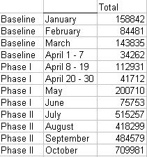
Arrange the data in a column. If trying to compare multiple sets of data, create another column indicating the set in which the data belongs. The data needs to be sorted by set.

Open Minitab
Go to STAT>>CONTROL CHARTS>>VARIABLES CHARTS FOR INDIVIDUALS>>I-MR
Select the column of the data (here, column 3) in ‘Variables’
If you are comparing multiple sets of data, go to ‘I-MR Options’ button, go to ‘Stages’ tab and select the column of the stages (here, column 1) in ‘Define Stages’
Hit ‘OK’ and the I-MR chart is ready.
Using the I-MR chart to see if the process is in control or not
Look at the MR chart first as the control limits for the I-chart is derived from the Range. So, if the MR chart is out of control, then the process is out of control. However, it has also been pointed out that for a normally distributed process any out of control situation would be visible on both I chart and MR chart simultaneously. So either chart can be used to check if the process is in control or not.
If there are any points outside the control limits, then the process is not under statistical control.
However, even if all points are within the control limits, the process could still be out of control. These are the indicators for the process NOT being in control even if all points lie within the control limits.
- 9 consecutive observations on the same side of center line
- 6 consecutive observations, all decreasing or increasing
- 14 consecutive observations alternating up and down
- 2 out of 3 consecutive observations, more than 2 sigma on the same side of central line
- 4 our of 5 consecutive observations more than 1 sigma from the center line, on the same side
- 15 consecutive observations within 1 sigma from center line, no matter which side
- 8 consecutive observations more than 1 sigma from the center line, mo matter which side
Using the I-MR chart to compare multiple stages of the process or compare multiple processes


very nice artical
ReplyDeleteIsn't that before we plotting the IMR chart, we need to ensure the data is normal distributed? please advice.
ReplyDeletevery apt explaination. Thanks,
ReplyDelete